Introduction
As mentioned in a previous blog post, we have been working on a set of UI components with the common goal of delivering a streamlined, low friction onboarding experience to our customers. Today we’re happy to announce the next step in that journey and release our sign-up/sign-in form component.
If you are a SlashID customer you can install our @slashid/react package to start using the components right away.
If you are not a customer yet, we’d love to give you a test account to try it out! Please send us an email at [email protected] or sign up to get started. The source code for our React components is available in our GitHub repository.
Features
The authentication form is a drop-in React component available to all our customers through the official SlashID’s React SDK. It supports all the authentication methods that our core SDK offers out of the box:
- WebAuthn
- Magic link via email or SMS
- One-time passwords
- Single sign-on
In order to use the component, customers only need to specify the authentication methods they want to use in the configuration object.
Configuration
Configuration is driven by a simple JavaScript object as illustrated below.
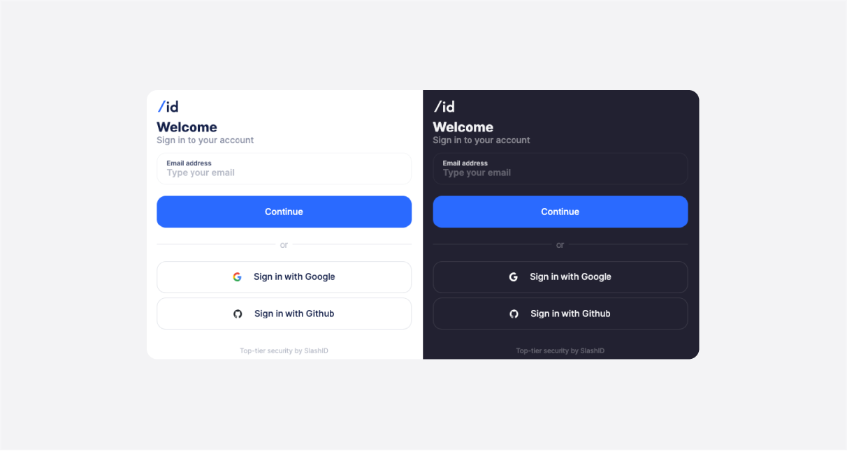
This example will result with the component rendering an email input for webauthn and two buttons for the login via SSO providers. The component instantly responds to any changes in the configuration and re-renders the UI, giving you a flexible and powerful platform for no-code experimentation.
The configuration object can be constructed dynamically or can also be fetched from a remote service. This facilitates a convenient way to experiment with the onboarding process and improve the related metrics without deploying any code changes.
Customization
The form is responsive and it will also adapt to dark and light display modes accordingly.
You can apply your own branding through standard CSS variables. This approach is both performant and flexible as it is not locked into a particular library or a build system. Using documented CSS variables you can customize the following:
- Logo
- Font family
- Color palette
If further customization is required, all the building blocks of this component expose public CSS class names that can be used to select and style the elements in place using CSS.
Text content and i18n
All the text content present in the form can be edited. In order to keep the component as light as possible there’s no built in i18n solution – you can simply pass in the translated strings using the configuration interface and the i18n library you already use.
What’s next
SlashID’s Authentication React components are just a piece of the puzzle as we aim to provide a full user onboarding solution.
More blog posts are coming up on how to improve your onboarding conversion using SlashID so stay tuned!


